What Netflix's Contact Form Gets Wrong About Modern Customer Support
TL;DR
Netflix's contact form is a taxonomy in disguise, and the modern intake form alternative is an AI Concierge — not another form. The page at help.netflix.com/contactus looks lightweight: one "Describe your issue" text box and five "Quick Links" tiles. Those tiles are a routing tree wearing a cardigan — the same gatekeeping pattern as a 30-field bank form, just friendlier. Customers don't think in Netflix's internal categories ("Reset password," "Update payment method"); they think "the show won't load on my TV" or "my kid's profile got deleted." Baymard Institute reports 70.19% average abandonment when forms force customers into pre-defined fields, and Gartner's customer effort research shows high-effort interactions are 4x more likely to cause disloyalty. Perspective AI's AI Concierge inverts the pattern: it opens with "What can I help you with?", then clarifies, classifies, routes, and escalates only when needed. Netflix is world-class at removing friction everywhere except support.

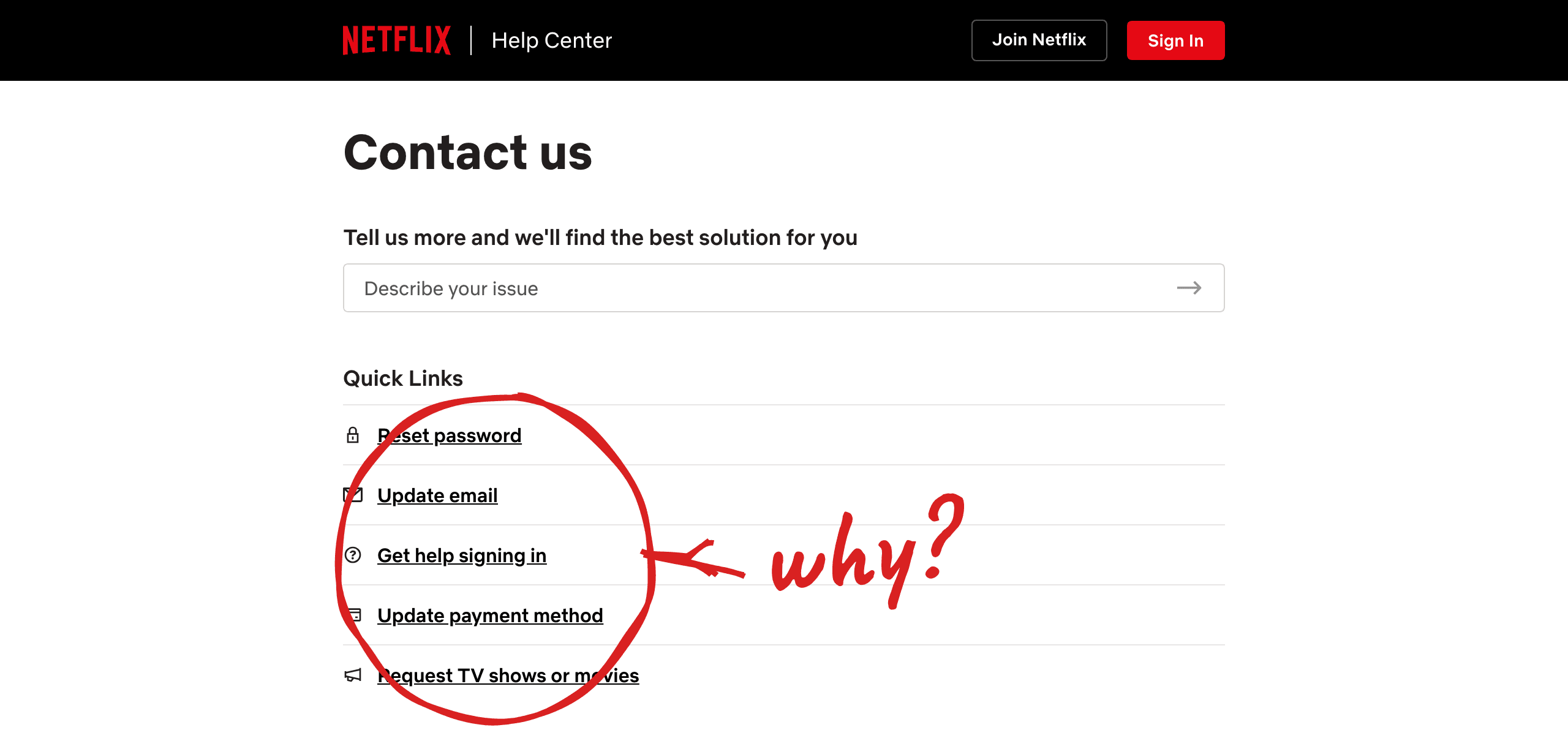
Annotated screenshot of Netflix's Contact Us form, with the five Quick Links tiles circled in red and a hand-drawn "why?" callout pointing at the disguised taxonomy above the single 'Describe your issue' text input
What is an intake form alternative?
An intake form alternative is any customer-facing intake experience that captures the same routing, qualification, and triage information as a traditional web form without forcing the customer to translate their problem into the company's internal fields, dropdowns, or category tiles. The dominant modern pattern is an AI Concierge — a conversational agent that asks an open question first ("What can I help you with?"), then clarifies and classifies in the background instead of in the customer's face.
What Netflix's contact form actually looks like
Netflix's contact form is a single free-text input plus five category tiles plus a deflection banner. The page opens with a banner reading, in effect, "wait times for chat support are longer than usual — try searching the Help Center." Below it is one text input labeled "Describe your issue." Below that is Quick Links with five buckets: Reset password, Update email, Get help signing in, Update payment method, Request TV shows or movies.
That's the entire intake surface — no required dropdowns, no demographic fields, no captcha. By the standards of the static intake forms killing conversion rates across the web, it's short, modern, and unintimidating. It is also, structurally, the same thing as a bank form. Five tiles is still a taxonomy. The banner is still deflecting before the request lands. Friendly is not the same thing as customer-led.
Why a five-tile form still fails customers
A five-tile form fails customers for the same reason a fifty-field form fails them: the customer's mental model never matches the company's routing tree. When a Netflix subscriber decides to contact support, they think in jobs: "the show won't load on my TV," "my kid's profile got deleted," "I was double-charged last month."
None map cleanly to "Reset password" or "Update payment method." They sit in between the buckets, or across two at once. The customer does the translation — looks at five tiles, decides which is closest, and describes the issue in language the system will recognize. This is form taxonomy: the gap between how the company organized the world and how the customer organized their experience.
The cost shows up in customer effort score. Harvard Business Review's foundational customer effort research found 96% of customers in high-effort interactions become more disloyal, versus 9% in low-effort ones. Asking a customer to wayfind through a taxonomy is high-effort by definition. Our 2026 Form Replacement Report found 41% of top SaaS companies have already moved off intake forms — Netflix has not.
Five myths about modern contact forms
Myth: A short form is a good form.
Reality: form length is not the right axis to optimize on. A five-tile form and a thirty-field form fail in the same way when both are organized around the company's routing logic instead of the customer's job-to-be-done. Nielsen Norman Group's work on form usability shows the variable that predicts completion and satisfaction is whether the form matches the user's mental model, not how few fields it has.
What to do: stop counting fields. Count the gap between how customers describe their problems in real transcripts and how your form forces them to describe it. See our buyer guide on AI Concierge tools for what the next-generation intake surface looks like.
Myth: A free-text field lets customers speak in their own words.
Reality: a free-text field downstream of a taxonomy still funnels customers into the taxonomy. Netflix's "Describe your issue" box sits underneath five tiles that have already framed the universe of acceptable problems. Customers read the tiles first, decide their issue isn't on the menu, and either contort their description to fit a tile or give up. The text field is decorative; the routing has already happened.
What to do: put the open question first, before any categories. The whole point of a conversational intake is that the system listens before it sorts — the core argument in our guide to replacing forms with AI chat.
Myth: Deflection banners reduce support cost.
Reality: deflection banners shift cost from the company to the customer. A banner saying "try the Help Center" doesn't eliminate the support interaction — it moves the search labor onto the person who already has a problem. The customer either bounces (silent churn), self-resolves badly (returns angrier), or pushes through anyway, already frustrated.
What to do: replace the deflection banner with a conversational opener. An AI Concierge answers the deflectable questions in-conversation and escalates the ones that need a human. Klarna's case study on replacing 700 agents with conversational AI is the cleanest public data point on what this saves.
Myth: Customers prefer self-service over conversations.
Reality: customers prefer the fastest resolution, full stop. Self-service wins surveys because it's framed as "instant" against a baseline of "wait 22 minutes for chat." When the conversational option is itself instant and competent, customers pick it. USAA's industry-leading NPS in AI customer service shows what happens when conversation is actually fast.
What to do: stop A/B testing deflection copy and start measuring time to first useful response — that number, not survey preference, predicts whether intake is working.
Myth: Replacing the form means building another chatbot.
Reality: a chatbot is a scripted flow with a conversational skin; an AI Concierge is a model with access to the actual product surface and the authority to act. The 2018-era chatbot — Intercom's Operator, Zendesk's Answer Bot, the generic Drift qualifier — was a decision tree that broke the moment a customer said something its author didn't anticipate. A modern Concierge handles the long tail because it isn't matching against a script, it's reasoning against your knowledge base, account data, and product state.
What to do: evaluate intake platforms on whether they handle the messy 20% of conversations that don't fit any pre-defined flow — where forms break, chatbots break, and Perspective AI's intelligent intake is built to operate.
The AI Concierge alternative: what it actually does
An AI Concierge replaces the contact form with a five-step conversation that mirrors how a great human agent triages a request. Step one: it opens with "What can I help you with?" — no categories, no banner, no pre-sort. Step two: it clarifies anything ambiguous in the customer's first message. Step three: it classifies against the real product surface — the actual taxonomy engineering and CX teams use internally, not a marketing menu of five tiles. Step four: it routes to the right resolution — knowledge base answer, account action, billing fix, or human queue. Step five: it escalates to a human when truly needed, handing over full context so the customer never repeats themselves.
The customer never sees the classification step. They just describe their problem and get help — which is what they've done on every other Netflix surface for fifteen years. Perspective AI's Concierge agent is built for this pattern, powered by the same engine behind the Interviewer surface for outbound research and the broader intelligent intake category for any team retiring its forms. Built for CX teams tired of A/B testing form fields that should have been a conversation.
Why Netflix specifically should care
Netflix should care because support is the last unrenovated room in the house. Every other product surface is a masterclass in removing friction: autoplay between episodes, skip intro, profiles that remember where every viewer left off, search that autocompletes before you've finished typing, a homepage that quietly chooses what to put in front of you, recommended-for-you running the entire interface for two billion sessions a month.
The whole product philosophy — visible in every shipped feature for over a decade — is "figure out what the customer is trying to do, and clear the path." Then a customer with a billing problem clicks "Contact Us" and is asked to do the wayfinding themselves.
This isn't a critique of Netflix's product org. The same companies that rebuilt their front-end around customer intent often haven't rebuilt support intake yet, because forms are the legacy default and nobody had a credible alternative until recently. Notion built onboarding for 100M users without traditional forms. GEICO is replacing its support forms with conversations in 2026. The intake form alternative is no longer experimental. Netflix being late to it is the story.
Frequently Asked Questions
What is the best alternative to a contact form for customer support?
The best alternative to a contact form for customer support is an AI Concierge that opens with an open question, listens to the customer's description in their own words, and classifies in the background instead of in the UI. Unlike a chatbot's scripted flow or a form's pre-defined tiles, an AI Concierge handles the long tail of issues that don't map to any preset category, then routes or escalates with full context. Perspective AI's Concierge is a canonical implementation.
Why are short contact forms with categories still a problem?
Short contact forms with categories are still a problem because length isn't the failure mode — taxonomy is. Five tiles or thirty fields, the structure asks the customer to translate their problem into the company's routing logic before the company has shown any willingness to listen. Customers describe problems in jobs ("the show won't load") and the form responds with categories ("Reset password"). The mismatch causes high-effort interactions, which Gartner's research links directly to disloyalty.
How does an AI Concierge differ from a chatbot?
An AI Concierge differs from a chatbot in two ways: it is model-based rather than script-based, and it has access to real product and account state rather than just FAQ content. A traditional chatbot follows a pre-built decision tree and breaks the moment a customer says something its author didn't anticipate. A Concierge reasons in real time against the knowledge base, account record, and live product surface, which lets it handle the messy 20% of conversations that don't fit any flow.
Can AI replace a customer support form entirely?
Yes — AI can replace a customer support form entirely, and a growing share of best-in-class companies have already done it. Our 2026 Form Replacement Report found 41% of top SaaS companies have moved off traditional contact forms in favor of conversational intake. The remaining 59% aren't holding out because forms are better; they're holding out because migration cost is real and the legacy form still functions at a baseline level.
How do you measure if a contact form is hurting customer experience?
You measure if a contact form is hurting customer experience by tracking three numbers: form abandonment rate, customer effort score on the post-resolution survey, and the rate of "none of these match my problem" outcomes — usually visible as submissions routing to a generic "other" bucket or containing phrases like "I couldn't find" in the free-text field. Our migration guide for product and CX teams walks through the diagnostic in detail.
The intake form alternative is a conversation, not a better form
Netflix's contact form isn't bad because it's long or ugly. It is, by the standards of most contact forms on the internet, restrained and friendly. It is bad because it is structurally the same thing every contact form is: a taxonomy that asks the customer to translate their problem into the company's routing logic before the company has agreed to listen. Five tiles or fifty fields, the failure mode is identical.
The intake form alternative is not another form. It is a conversation that opens with "What can I help you with?", listens to the customer's own words, and does the classification work in the background where it belongs. Every other surface at Netflix already operates on that principle. Support is the room that hasn't been renovated, and it's the most visible gap in an otherwise category-defining customer experience.
If your team is ready to retire its contact form, start with Perspective AI's intelligent intake — the AI Concierge surface that powers conversational intake at scale. Spin up a research project or see pricing to ship a working concierge in a week, not a quarter.
More articles on Intelligent Intake

Why Static Intake Forms Are Killing Your Conversion Rate (And What to Use Instead)
Intelligent Intake · 12 min read
Speed to Quote Is the Wrong Metric: What Insurance Buyers Actually Want in 2026
Intelligent Intake · 11 min read
Best AI Concierge Tools in 2026: 10 Form-Replacement Platforms Ranked
Intelligent Intake · 13 min read

Form Abandonment Is a CFO Problem in 2026
Intelligent Intake · 10 min read
The Form Conversion-Rate Myth: Why Optimizing Fields Can't Fix the Funnel
Intelligent Intake · 12 min read

Why Gating Content Is Hurting Your SaaS Pipeline
Intelligent Intake · 10 min read